Are you confused about how to deal with your received data after conducting a survey?
If you’ve ever felt depressed about Excel or Google Sheets filled with dozens of survey data rows, this article will help you out.
The topic for discussion today centers on how to analyze survey data in Excel and Google Sheets.
Through this article, you’ll also gain knowledge of important survey data as well as several points to consider when analyzing survey data.
- Important Survey Data Types
- Points to Consider When Analyzing Survey Data
- How to Analyze Survey Data in Excel
- Analyzing Responses in Google Sheets
Important Survey Data Types
There are two basic data types in surveys, close-ended and open-ended questions.
While open-ended questions always ask users to provide feedback in their own words, close-ended ones contain pre-designed options for participants to choose from. These options can be very short and absolute answers, usually one-word.
The close-ended questions appear in many forms, such as multiple-choice, dropdown, and ranking questions. They’re created to deliver quantitative data which allows you to easily segment participants based on the options they’ve chosen.

On the other hand, the open-ended questions are designed to gather rich, qualitative data derived from the user’s opinions and feelings. They tend to be more detailed and objective, plus, harder to analyze because they’re not settled in any structured manner. These questions often start with “why,” “how” or “tell me about” phrases.

Points to Consider When Analyzing Survey Results
Before you put the number into play, there are some points you should consider to successfully work your result out.
Understand Your Survey Goals
Previous to conducting a survey, you should take into account your survey goal, whether it helps you gain high-level insight or measure effects. If the former is the point, then a low response rate might not be a matter. Feedback is just feedback and precise in pointing out and letting you understand your issues.
On the contrary, a high response rate matters a lot in measuring changes and impact. For example, you can’t find out whether customers enjoy your service innovation if there’s a small group of them completing your surveys.
Therefore, staying focused on your survey purposes is crucial, as it decides the way you analyze and utilize your data.
Segment Your Responses
Different customers have different desires. From the marketing perspective, segmenting your responses carries weight in understanding customer needs and identifying target products.
You can categorize your responses based on various variables, such as region, age, gender, shopping hours, or type of customer, and so on. You can also compare a distinct customer segment to another. For instance, existing vs new users, or urban vs rural consumers. The more you slice and dice your customers, the greater insight you’ll get.
Context is Key
We can’t emphasize the importance of context enough. When showcasing statistics or comparing data, you should think about providing context.
Let’s assume that after calculation, you get the result of 40% customers satisfying with your services. However, what does 40% exactly stand for? Is it a positive indication of improvement?
Without context, you’ll never know the meaning behind your data. To truly figure out what your data means, remember to perform a comparison to the same survey done at different points in time.
Focus on Insight, Not Data
As we mentioned above, the insight lies in the core of survey analysis. Data is just the number and percentages, while insight contributes to forming the future marketing or promotion plan, or a new product.
The vital part of doing survey analysis is the insights you sum up from the data and what action should be taken next developed on those insights. Plus, data proves valuable only when it’s converted to material that can be used in business decisions.
You’ve equipped yourself with essential knowledge of survey data types and some crucial points to consider when analyzing the survey result. In the next part, we will show you how to analyze survey data in Excel and Google Sheets.
How to Analyze Survey Data in Excel
There are 4 basic stages you’ll go through when analyzing survey data in Excel:
- Count all kinds of feedback in the survey
- Calculate the percentages of all feedback
- Calculate correlation and compare data
- Create charts and graphs to visualize data
Let’s get started!
Count All Kinds of Feedback in the Survey
Before analyzing the survey result, the first and foremost thing you should do is rearrange your excel sheet for easy counting.
To do so, you need to delete the empty data rows.
- Select the data columns, go to the “Data” tab in the ribbon and choose “Filter.”
- Click the down arrow in the column header, uncheck the “Select All” box. Keep scrolling down and select the “Blanks” option. Click “OK” and all the blank data rows will be selected.
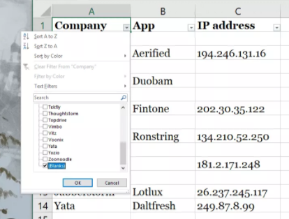
- Choose the filtered row. In the Home tab, click Delete > Delete Sheet Rows.
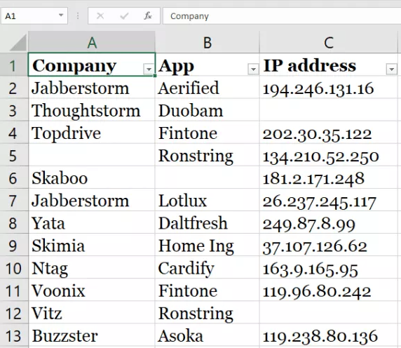
- Next, head over to the “Data” tab, press “Clear” to remove all the selected blank data rows and you’re done. The final result will be like this:
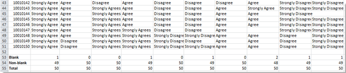
From here, you can get an overview of your survey result by figuring all kinds of feedback.
For example, you can easily count the numbers of blank cells or non-blank cells to compare with the total amount of data you get. This comes in handy as you can determine how many answers aren’t provided for each certain question asked. Most importantly, it provides insight into how effective your questions are in targeting the audience.
- To count the numbers of blank cells, click on a blank cell, use the formula =COUNTBLANK(first_cell:last_cell), and hit enter.
- To count the total number of non-blank cells, use this formula =COUNTA(first_cell:last_cell).
- Apply this formula =SUM(B53:B54) to count the total feedback cells.
Calculate the Percentages of All Feedback
From the counting you’ve just performed, you can calculate the percentage of each feedback on every question for easier analysis. This is helpful if you wish to get a closer look at evaluating user satisfaction.
Utilize this formula =A/$B$b to sum the total feedback, then press “Enter.” After that, format the percentage by right-clicking > Formats Cells > Percentage.
For instance, input this formula =B8/$B$12 in your actual excel file, in which B8 stands for the cell containing special feedback that you want to count its numbers. $B$12 indicates the cell consisting of the total number of feedback.
See the image below for the result:

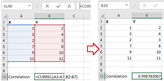
Calculate Correlation and Compare Data
The correlation helps you compare and understand the relationship between 2 variables.
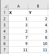
- Choose a blank cell, enter this formula =CORREL(A2:A7,B2:B7), in which A2:A7 and B2:B7 are the two variable lists you want to compare. (see the image above)
- Press enter and you’ll get the result as below.
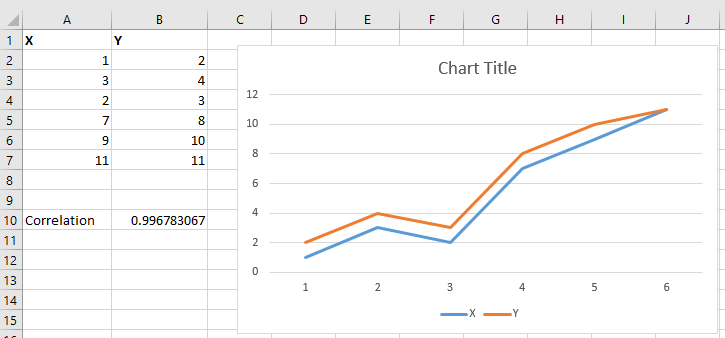
- Insert a chart to display the result visually. This lets you better understand and easily compare your result.
Note: You can’t use the “Correl” function if there are more than 2 variables to compare.
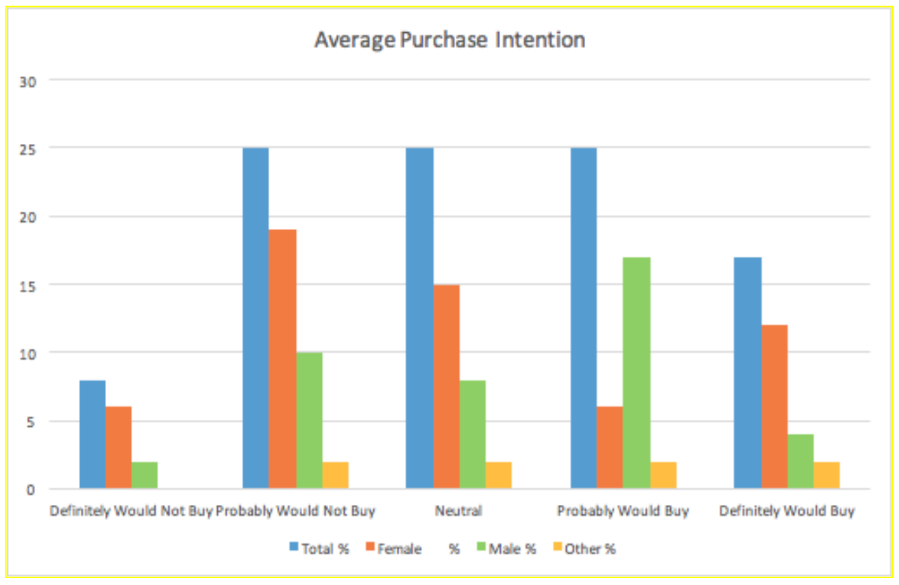
Create Charts and Graphs to Visualize Data
Considering some specific data can be hard to digest if presented in a traditional way, the visual medium makes crunching data a walk in the park.
Depending on the survey you carried out, there are many types of charts and graphs you can use.
From the “Insert” menu, select the suitable ones, including pie charts, diagrams, histograms, line graphs, and more. Make sure that the selected one displays data in an accurate and comprehensive way.
We’ve shown you how to analyze survey data in Excel by providing several useful formulas. Now, let’s move to the next part on how to analyze responses in Google Sheets.
Analyzing Responses in Google Sheets
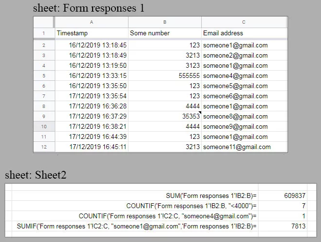
To analyze the responses you get from the Google Forms spreadsheet, you need to create a second sheet and implement all the essential formulas there.
You can use these formulas, including SUM, MAX, MIN, COUNTIF, and so on to do a basic calculation on the responses. Refer to the image below for an example.
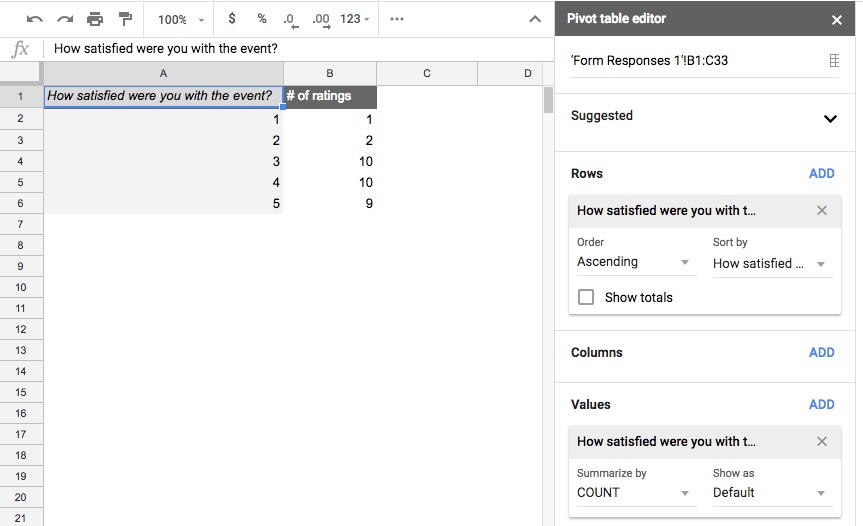
If your form has a large number of responses, consider using a pivot table. It displays information in a more manageable way, which allows you to easily summarize the data. To create a pivot table, you need to:
- Select the cells (including column headers) you want to include in the pivot table.
- In the “Data” tab, click “PivotTable.”
- Under “Insert to,” choose where to add your pivot table, then click “Create.”
- On the right side of your screen, you can set up the rows, columns, filters, and values for your pivot table.
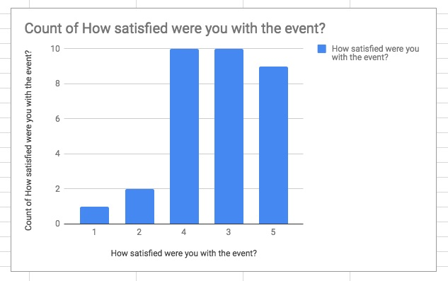
Besides, you can make use of pivot charts and histogram charts to showcase your data in a more visual way.
To create a chart, click Insert > Chart and select your preferred type of chart in the “Chart type” drop-down menu.
Final Thoughts
We have walked you through several important types of survey data, as well as how to analyze survey data in Excel and Google Sheets.
Analyzing survey results plays a key role in understanding user needs and making crucial business decisions. While the numbers or percentages you have calculated are vital for data evidence, the conclusive insight out of these data strongly influences the next action you take.
In case you’re not able to come up with the recommended actions from your survey analysis, at least, you should highlight what needs more attention so that any potential issues can be tackled if necessary.