People usually pay attention to create a sleek homepage and seem to discount the contact us page. In fact, the contact us page carries a lot more weight than it may seem.
An effective contact page not only welcomes prospects, saves your time on emailing back and forth, but also optimizes the customer support process and reduces junk messages.
Looking for the best contact us page examples for inspiration?
This article will highlight 9 useful tips to create the best contact us page that helps boost your site conversion.
We’ll also cite some contact us page examples and point out the good and not-so-good.
- #1. Stay Sleek, Creative, and Consistent
- #2. Include Your Contact Information at the Top and Bottom of a Web Page
- #3. Keep It Simple
- #4. Include a Video or Call to Action
- #5. Reduce Spam Messages
- #6. Provide Different Communication Options
- #7. Don’t Forget Your Social Media Channels
- #8. Set Expectations
- #9. Try Using Chatbots Instead of Traditional Contact Forms
- Contact Us Page Examples: The Bad and The Good
#1. Stay Sleek, Creative, and Consistent
When readers visit your contact us page, it means that they want to start a new relationship with you, whether they want to know more about your products or seek help from your team.
Considering the human brain is hardwired for visual content, a sleek and creative contact us page design will leave a positive impression in their minds. This excites users to get in touch with you.
Plus, your contact us page design and copy speak volumes about your site persona. It must be consistent with the rest of your site. This means your contact us page should have similar colors, fonts, and images as the other pages. Users will be confused if they are redirected to a page that looks like a whole new site.
#2. Include Contact Information at the Top and Bottom of a Web Page
Don’t just provide your contact information on your contact us page. Instead, let place your contact info at the top and bottom of every page on your site. That way, users can get in touch with you immediately any time they need help or additional information. This proves handy as they don’t need to waste extra time and effort searching for your contact details.
As too much contact info may distract users, you should display the most basic one, e.g. email address and phone number at the top and bottom of your web pages.
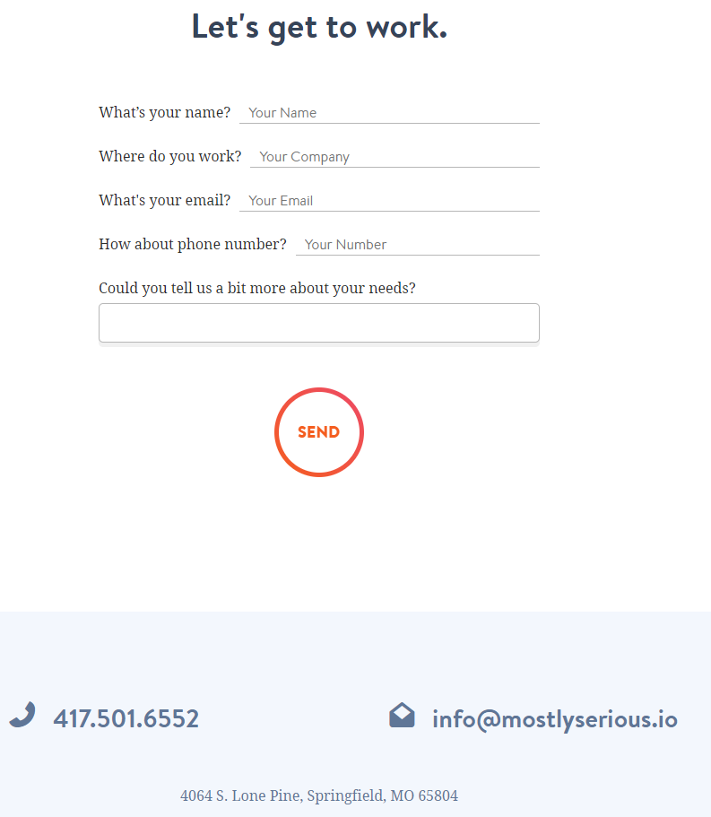
Mostly Serious does a great job of placing contact info clearly at the bottom of each page.
#3. Keep It Simple
The main purpose of the contact us page is to encourage users to reach out to you. A contact us page filled with too much information and a lengthy form can be a barrier challenging user time and patience. As such, keep your contact us page short, sweet, and to the point as much as possible.
To do so, you should avoid unnecessary copies. If you use a contact form, reduce the number of form fields by asking for the most essential information only, e.g. first and last name, email address, and reasons for reaching out.
You know what? If your contact form has 3 fields, the optimal conversion rate is around 25%. If the form fields increase from 3-5, the conversion rate drops to 20%, and continually falls by 15% for six or more fields.
Plus, some contact us pages require users to input personal/business phone numbers and wait for phone calls. This is, unfortunately, a conversion killer. Statistically, 37% of users are found to abandon the contact us page as they are prompted for their phone numbers.
#4. Include a Video or Call to Action
Bear in mind that the contact us page is a landing page as well. And including a call to action or a video proves one of the most simple yet effective ways to improve landing page conversions.
While videos provide users with an intuitive experience, a clear call to action gives them concise directions on contacting process. For example, Tell us about your business or Please describe your request in detail. That way, your visitors are free from wasting time thinking about what to do next.
Pro tips: Videos should be short, intuitive, and straightforward. Don’t let long and large videos cause users to run out of steams and drag down your site speed.
#5. Reduce Spam Messages
Besides serving as a gate to communicate with prospects, your contact us page can be a target for spammers to send junk messages. And of course, you can not just password protect your contact page or contact details to block spam as it may restrict legitimate users too.
So, how can we maintain a great response rate and reduce spam messages at the same time? The best way out is that clearly set the conditions for email sending. In other words, once users meet certain defined requirements, they are eligible to email you.
To achieve that, you can make use of a conditional logic contact form. It will display the message field as soon as users answer defined questions.
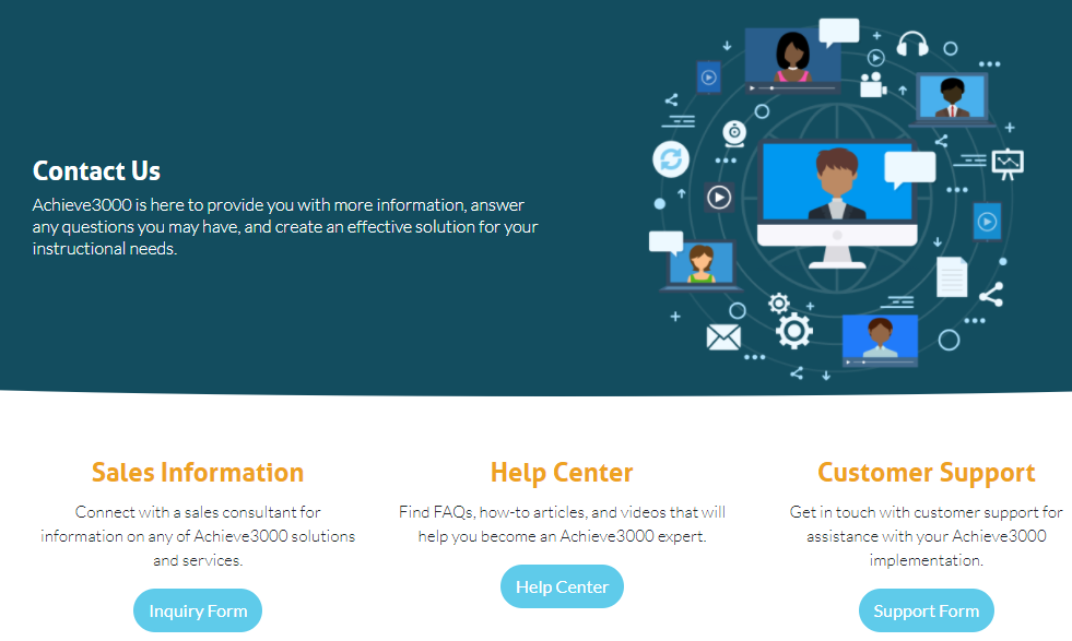
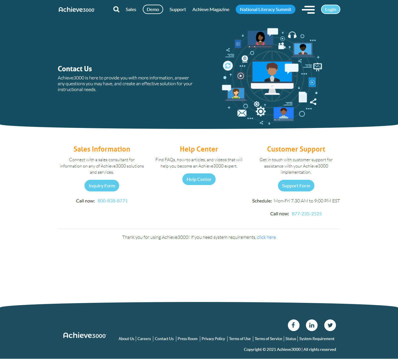
Alternatively, you can include explicit instruction on what types of contact people keep in with you. This is killing two birds with one stone. Not only can you get rid of spam without using CAPTCHA, but it’s also convenient for customer support. Take Achieve3000 as a good example.
#6. Provide Different Communication Options
Visitors get in touch with you for multiple purposes. Providing different communication options enables you to lighten the customer support burden by catering to each specific need.
Many websites also add an email address next to a contact form. In case contact forms refuse to fulfill their duty, people can reach out to you via email instead.
#7. Don’t Forget Your Social Media Channels
According to Hootsuite, “90% of people with access to the internet use social media.”
With the rapid growth of social platforms, more and more people prefer to contact brands on social media for fast response. Therefore, don’t forget to link your social media channels to your contact page. By doing so, you also give them a chance to learn more about your website and business.
#8. Set Expectations
What is this form used for? When and how will you get back to users? These details should be highlighted on your contact us page.
Any request sent always looks forward to being heard out. You should assure users that you will contact them back with a certain amount of response time. And remember to keep your words as this is how you build trust and respect with your customers.
#9. Use LiveChat or Chatbots Instead Of Traditional Contact Forms
No response may be the biggest fear that drives users hesitant to submit a form on your contact us page. Imagine you need an immediate reply but your outreach gets stuck in email queues or the spam box. It may take your request a while to be noticed and resolved.
Compared to contact form or email, live chats or chatbots provide more instant support. By adding a quick chatbox on your contact us page, you can answer their questions, ease their concerns on the spot. From there, it’s much easier to build stronger customer relationships and drive more leads to your sites.
Contact Us Page Examples: The Bad and The Good
In this section, we’ll bring forward some great and not-so-great contact us pages.
Let’s start with the not-so-good one first!
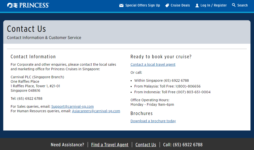
Despite its popularity and professional services, Princess Cruise possesses a quite boring contact us page. Nothing special can pique traveler interest here, not to mention some vital information, including email address is buried at the very bottom of the page. It took us a while to navigate where the contact detail section is.
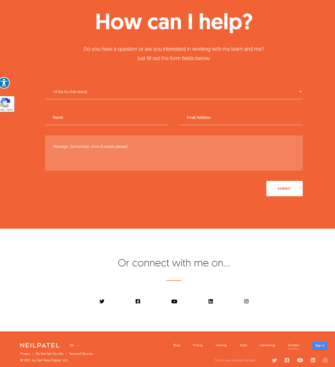
On the contrary, the contact us page of Neil Patel wins our hearts. It’s short, simple, to the point, and consistent with the rest of the web page. What’s more, it offers a clear call to action to guide users through the contact process. Customers can also get in touch with him via Facebook, Twitter, or Instagram.
Another great contact us page example comes from Achieve3000. Users can easily choose types of contact queries via each separated section. Its contact us page is really intuitive with all essential info provided. We find it no hard going at all to navigate through the page and get the info we need.
Plus, the design matches with the main theme and you can connect with them via social media channels or 24/7 chatbox.
It’s Time to Create Your Contact Us Page!
Whether you’re a newbie starting a blog site or you’ve managed a website for a while, it’s never too late to create the perfect contact us page.
This article has walked you through 9 useful tips to build an effective contact us page that converts. Numerous visual examples are also showcased to let you have a practical insight into contact us page designs, styles, and layouts.
Apart from our 9 tips, do you have any design tricks or favorite contact pages that want to show off? Share your picks in the comments below!