
It was in 1994 that web forms started to be used for online sales for the first time. Since then, they have been serving as the cornerstone of online interactions. Businesses rely on web forms to enrich their email lists, gather customer data, generate leads, sell products, and more.
“The majority (86%) of people fill out at least one web form per week.” Clutch.co
As a matter of fact, creating a web form is such a piece of cake with the help of dozens of form builders. However, optimizing your forms into well-designed ones that increase both user experience and conversion rate is never a breeze.
A professional, sleek, simple-to-use web form plays a crucial role in converting users into customers. In this article, we will showcase 13 form design best practices that help you design great forms, make them UX-friendly, and of course, boost your form conversion rate.
- Form Design: Appealing Forms Gain Trust
- Short Forms Win
- Stick with Single Columns
- Indicate Errors Wisely and Clearly
- Use Inline Form Field Validation
- Limit Typing
- Use Drop-down Menu, Radio Button, and Checkboxes Wisely
- Use reCAPTCHA instead of CAPTCHA
- Allow Showing/Hiding Passwords
- Arrange Form Fields from the Simplest to the Hardest
- Include Strong Social Proof
- Focus on Mobile Users
- Optimize the CTA Button
Check out this infographic if you need a quick summary!
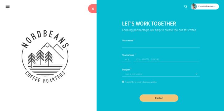
Form Design: Appealing Forms Gain Trust
According to the aesthetic-usability effect, beautifully designed forms and websites are more likely to gain trust from users than less impressive ones. On top of that, an appealing interface increases user patience and even wins their sympathy to form design mistakes.
So you know what to do. Beautify your forms with eye-pleasing themes and the right color scheme. For example, choose vibrant colors for the CTA button to grab user attention and neutral ones for text fields or background. Be mindful of the number of colors in your form. The more colors you use, the more distracted and messy your form is. The ideal number should be 3.
Plus, your form should support color-blind people, as around 4-10% of form users have problems in perceiving colors, especially red and green. It would be better if you use additional texts or icons along with colors when displaying error messages.
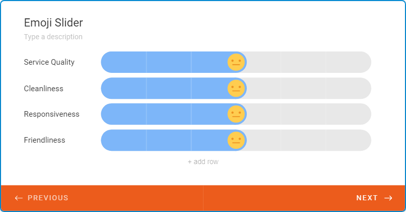
Apart from that, you can utilize icons, emoji, or shapes to make form-filling more enjoyable. It works best for some specific form types, such as evaluation or feedback forms.
Short Forms Win
Users may feel tiresome to fill in a form with so many fields on it. It’s important to design a form as short as possible, by asking for the most relevant information only. Minimizing the form fields gives users the “free and easy” sense for form-filling, leading to fast form completion and higher form conversions.
Clutch.co found out that 67% of users take around 1-3 minutes to fill out online forms. However, experts still advise keeping the form “as short as streamline as possible.”
Let’s look at these two clear examples in reality. Expedia suffered a big loss of $12 million in revenue per year only because of asking additional questions about the company name. By cutting away 7 form fields, from 11 to 4, Imagescape was able to boost their conversion rates up to 120%.
Carefully think about your questions, whether it is really necessary. In case you do need to gather lots of information, think about breaking your form into a multi-step form with a progress bar.
Keep in mind the KISS (keep it simple, stupid) principle. It works in various sales and marketing strategies. And so do the web forms.
Stick with Single Columns
A painless yet always effective way to encourage users to fill in forms is to design the form in the single-column style. By nature, the human eye scans information vertically way faster than horizontally. Multi-column layouts force our eyes to move back and forth, which causes distraction and interrupts user flow.
“The single-column form was faster to complete. Survey participants completed single-column forms an average of 15.4 seconds faster than the multi-column forms.” CXL.

Along with that, users may misinterpret how to fill out multi-column forms, whether they should start filling from left to right or top to bottom. Therefore, straightforward single column layouts do help a lot in saving users time and effort.
Indicate Errors Wisely and Clearly
The way you design error messages matters a lot in how users fill in forms.
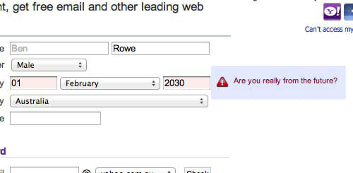
Form error messages should be positive and straightforward. They must point out where the error is and how it should be corrected.
Avoid using too generic error messages like “Something went wrong” as it will confuse and irritate users. What exactly is “something”? Users have to scroll up and down to find the error. Instead, display some specific and if possible, witty error messages, like the example below.
One more thing, you should display error messages next to the respective fields. We recommend you use inline form validation. The reason for that will be explained right in the next part.
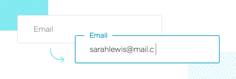
Use Inline Form Field Validation
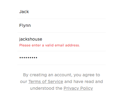
Inline form validation happens when users type their data into a form field and this data is checked in real-time.
Error messages will instantly show up if users input incorrect information, for example, invalid credit card number or email address. This helps users quickly notice and correct their errors as they’re filling the form out.
Limit Typing
Typing is the most time-consuming process in form completion, not to mention typos, especially on mobiles. Limiting typing by enabling the auto-fill feature allows textual typing to be converted into clicking.
Moreover, you can enable the browser auto-fill feature to save typing time. Browsers like Google or Firefox have the auto-fill function that allows you to complete the form in a flash. To enable that feature, your form fields must be in common terms, e.g. “first name,” “email,” or “date of birth” so that browsers can easily recognize them.
If possible, your forms should be auto-connected to other social accounts, so names, phone numbers, or emails can be auto-saved. This helps significantly reduce the typing effort and speed up finishing forms.
Use Drop-down Menu, Radio Button, and Checkbox Wisely
It’s believed that replacing drop-down menus with radio buttons and checkboxes in forms can help to minimize cognitive load. However, not in all circumstances, it’s true. The thing is, you must know when to use radio buttons, checkboxes, and dropdowns.
Radio buttons should be used if there are not many options and only one option can be chosen.
Checkboxes are great if more than one option can be selected. And a drop-down menu works best if you have a lot of options, for example, when you ask for a year or date of birth.
So the rule here is if your choices of answers are less than 6 items, opt for checkboxes and radio buttons. And if they’re more than 6, drop-down menus are more effective.
For user readability, the radio buttons and checkboxes should be vertically-stacked. The horizontal layout makes it hard for users to view, compare all options and choose the most suitable one.
Radio buttons limit users in the number of given options. Therefore, you should include an additional option labeled “Others” along with a tying field. This gives users flexibility if their preferable answers are not listed.
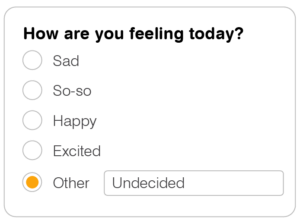
For the checkbox, you should arrange options in a logical order. Remember to use positive words instead of negative words. Because negative words will confuse users, positive modes will indicate their selections as true.

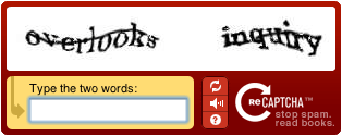
Use reCAPTCHA Instead of CAPTCHA
CAPTCHA contributes to shielding your forms from spam and abuse. However, CAPTCHA also annoys users due to its prolixity in images, numbers, or letters. Figuring out that hard-to-read stuff is really time-consuming which results in users abandoning the forms.
So what should be used to both protect your forms and improve UX?
It’s when reCAPTCHA comes in handy. With reCAPTCHA, users just need to check in the box to prove they are not robots and then hit submit. The process is much faster and hassle-free.
In case you want to optimize your UX to the utmost, consider using reCAPTCHA v3. It’s powerful and especially works behind the scenes, which doesn’t interrupt user flow.
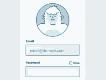
Allow Showing/Hiding Passwords
Masking passwords is a common practice to secure your passwords from snoopers. While it indeed enhances data security, it seems to destroy user experience, especially for mobile users.
Password masking results in more typos as users can’t see the incorrect words when they’re typing. Let’s imagine if users fail to type the right password in the sign-up form, their account can be locked along with the password-reset message.
Moreover, don’t ask users to confirm their passwords twice. The idea behind password confirmation is to improve accuracy. However, this equals adding more work for users and increasing more typo possibilities.
So, the thing is you should put yourself in the user’s shoes. A simple yet effective solution for both problems listed above is inserting a showing/hiding password feature that lets users see what they type.
Arrange Form Fields from the Simplest to the Hardest
The way you arrange your questions contributes to your form conversion as well. Arranging form fields from the easiest to the hardest will encourage people to fill in forms.
Asking complex questions from the beginning may result in a high chance of form abandonment. If your forms contain these questions, e.g. banking or credit card details, you should place them at the end.
The ideal question order should start with simple questions like name, email address, phone number, and then complex questions, such as bank account, shipping cost, etc.
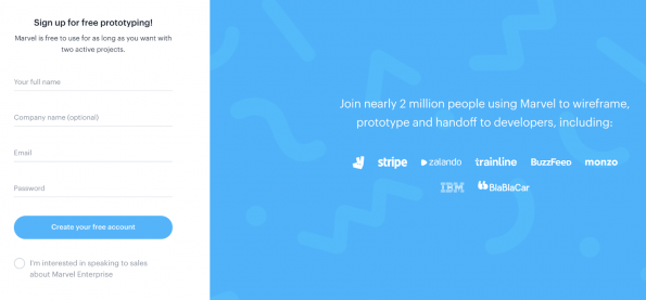
Include Strong Social Proof
Displaying statements as “300,000 people have registered” or “Used by 1 million people” can stimulate users to fill in the forms. This acts as an effective persuasion technique to build trust and comfort hesitant visitors to sign up.
Focus on Mobile Users
According to a study by Google, up to 48% of users felt companies didn’t care about their business if their sites didn’t work well on mobile devices. The same matter can be applied to your forms.
Nowadays, users access your forms via various mobile devices. Optimizing your form into a mobile-friendly design plays a crucial role in increasing user engagement as well as form conversion rate.
Here are what you should consider:
Design a Finger-friendly App Form
Bear in mind that the smaller the touch targets are, the harder it is for users to finish their forms. The small targets force users to pay more attention to press the targets accurately. Therefore, make sure that you design your forms with finger-sized elements.

Labels Should be Concise, Objective, and Placed Above the Entry Fields
Designing forms for mobiles requires more effort because of the limitation on space. Everything, including labels, needs to be optimized to the simplest yet most precise.
Normally, labels are placed inside the field entry so that they will disappear when users type in. However, the best practice for labels is that you should place them above the field entry. This is useful when users need guidance while typing in forms.
Optimize the CTA Button
The submit button plays the most crucial part in a form. Optimizing it greatly contributes to increasing the form submission rate. Instead of keeping the boring default “Send” or “Submit” form button, you should replace them with a descriptive, strong call to action, for instance, “Download Now,” “Get it Now,” “Sign In,” or “Create an Account.”
Plus, using bold brilliant colors like red will easily capture visitors’ attention and urge them to click on it. According to a study of Midas Media, orange, blue, red, and green are the top four popular colors that strongly evoke a feeling of “give it a go.”

You can also think of trying simple effects, such as arrows or gradients to make your button stand out. Another aspect needed to consider is the button size. Too small buttons will sink like a stone whilst oversized ones will be perceived as spammy or pushy.
How do you decide the size of your CTA button?
Unfortunately, there are no fixed principles for this. To find out, you have to do A/B testing. Invite friends, co-workers to take the test, note down their feedback and then make a decision.
Conclusion
This article has provided you with insight into 13 form design best practices to take your form to the next level – great, UX-friendly, as well as boosting conversion rate.
Keep in mind that your form must be short, well-designed, mobile-friendly, social proof included, and use single columns.
In terms of privacy, allow showing/hiding passwords as well as implementing ReCaptcha to ensure user flow and form security.
Pay special attention to your CTA button, as it’s the determining factor to your form conversion rate. Remember to beautify your button with vibrant colors and fill your submitted text with strong, descriptive phrases.
Lastly, when you have your proper forms, we recommend you test your form, to make sure there’s no friction.
Now that you’ve known all the form design tips, it’s time to put them into practice and deliver your best forms to users!
Need more guidance on this topic? Let us know by dropping a comment below!
If you like this article, hit “Share” and reach out to our website for more useful tutorials and interesting topics!