
Forms, in general, are the key factor in gathering information from users and generating potential leads. However, not all the time forms convert the way you want them to.
Sometimes, you may find yourself wondering: “Why don’t your visitors fill in your forms?” Though you aren’t able to read their mind to find out the answers, there are still some viable ways to help you improve the situation.
In this article, we will show you how to increase your web form conversion. By following our 7 simple tips below, you can take your form conversion rate to the next level.
- #1 Optimize Your Forms
- #2 Place the Form Above the Fold
- #3 Pay Attention to Form Titles and CTA Phrases
- #4 Include Privacy Policy
- #5 Use a Confirmation Email and Landing Page
- #6 Set Up Conversion Tracking
- #7 Do A/B Testing
#1 Optimize Your Forms
Forms serve as the backbone of converting customers. A well-designed form will provide users with a positive experience and contribute to the conversion. Therefore, the first and most important thing is making your forms outstanding, noticeable yet identical with your brand and purposes.
An ideal form must have a simple, vertical layout and provide enough space to fill in. Each form field should be clearly labeled to inform users of the specific information required. In terms of colors, bind your form with the right color combination, and don’t mess it up with more than 3 colors.
Next, you should minimize the number of your form fields. Humans are lazy by nature. Asking users to fill long-form fields may result in form abandonment.
Marketo is a typical example. Marketo’s form conversion rate increased up to 120% after they removed 7 fields out of their 11 field-form. Cut your form short and include the autofill feature to speed up the form completion process. To do so, focus on asking the most essential information only. In case you must create a long form, think about breaking it into a multi-page form with a progress bar.
Moreover, users access your sites via various devices. Optimizing your forms for mobile devices is a great idea to encourage user engagement with your sites. Google pointed out that 67% of mobile users are more likely to buy a site’s product or service on a mobile-friendly site. Therefore, to increase the likelihood of form conversion, you should convert your forms to mobile-friendly ones.
We recommend you use Google Analytics to find which most common mobile devices are used to check your site so that you can adjust your forms accordingly.
#2 Place the Forms Above the Fold
The “fold” idea originated from the newspaper industry. Eye-catching images and intriguing stories were placed above the fold to grab the reader’s attention. The juicier the stories were, the more likely newspapers would be sold. Nowadays, this principle works for web forms as well.
The form placement on your site does determine your form conversion rate. According to eye-tracking studies of Nielsen Group, almost 80% of users spend their time above the fold.
Visitors always want to see the information they look for without having to scroll down. What appears in their sight will influence their overall experience, so ensure your forms are put above the fold with straightforward content.
#3 Pay Attention to Form Titles and CTA Phrases
The aim of using form titles is to inform users what they will get after submitting the form. Reality shows that bold, big form titles and headlines will easily catch the user’s eyes.
Along with that, the CTA phrases play a key role in taking your form conversion rate to the next level. They will encourage users to follow what you want them to do. So, instead of using the boring “Submit” word, let’s brainstorm other strong and catchy words that match your form’s subject. For example, you can consider using “Download,” “Get Free Ebooks,” “Click Here,” or “Join A Class Now,” etc.
Besides, you should add some sense of urgency to your CTA phrases, urging your potential customers to take action. For example, “Last Chance,” “Now,” “Only 1 Hour Left,” and so on. Avoid stuffing your form with too many powerful words, which may bring a sense of “surreal” to users.
What’s more, a strong CTA button must come with outstanding colors. A study of Midas Media proves that orange, blue, red, and green are the top four favored colors that deliver a strong call to action.
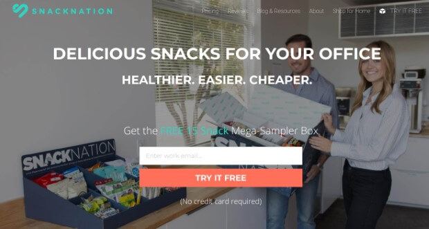
The form of SnackNation meets all of the criteria above. The title is capitalized, in bold and straight to the point, which is offering delicious snacks. The submitted text is changed to “Try it free” with an orange background, which makes it really stand out.
#4 Include Privacy Policy
In the internet era, attackers always take advantage of internet loopholes to steal user personal data. This leads to users’ cautiousness in revealing personal information, especially their banking and credit card details. Adding a positive privacy note to your form will help users feel secure and personalized. This allows you to build trust with them as well.
However, not all privacy notes work. The thing is your privacy notes must be used wisely and creatively. Because in some cases, the copy matters outweigh the security ones.
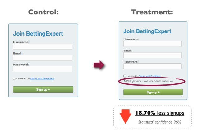
This typical “100% privacy—we’ll never spam you” privacy note may no longer be strange to you. Contentverve.com included this line in their forms and unexpectedly, it caused the conversion rate to fall by 18,7%.
Why is that? The answer lies in the word “spam,” which is one of the “conversion killers” elements. It makes people become anxious and hesitate to fill forms.
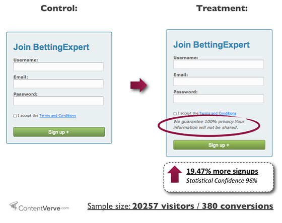
Later, Contentverve changed the privacy policy text to “We guarantee 100% privacy. Your information will not be shared.” and their conversion rate surprisingly gains 19.47%.
Consider some of our suggestions: “We respect your privacy” or “Your information is 100% safe” and you’ll see the difference.
#5 Use Confirmation Emails and Landing Pages
Informing users that they have submitted the form successfully also helps increase the form conversion rate. Not only does it build a strong customer relationship with proactive and clear communication but you can also provide patterns into customer behaviors.
As soon as they press the submit button, redirect them to a landing page or give them a thank you note with gratitude and appreciation. Plus, you should include contact information in case of urgency.
On top of that, if you give them a follow-up promise within 24 hours, make sure you make it happen.
Apart from order confirmation emails, you have 3 other types of email confirmation, including Registration, Booking, and Subscription.
Bear in mind to always keep your confirmation email short and sweet, branding matter, mobile-friendly, and a powerful call-to-action included.
#6 Set Up Conversion Tracking
How can you measure your conversion status without tracking it? Tracking your form conversion rate enables you to figure out potential issues and identify the solution on how to fix them. There are many reliable conversion tracking tools to give you a hand, such as Google Analytics and Hotjar.
Google Analytics allows you to track many types of conversions, including form conversion. The data is collected based on user activities. If a visitor completes a form and reaches a “thank you” page, Google Analytics will track that activity, then show you the traffic source and compare it with the conversion goal.
Hotjar, on the other hand, doesn’t give you direct conversion data but enables you to analyze how users interact with your forms. Its heatmap provides in-depth data about which fields take users longer to fill in or which form section they abandon the most. This helps you to understand user behavior and optimize your forms for the better.
Conversion plugins are the best and easiest way to rocket your site conversion. Check out our review on the top 7 WordPress conversion plugins for you to boost your sales.
#7 Do A/B Testing
Any part of your website can potentially cause friction. So do your forms. A/B testing is the pain-free and most effective way to minimize your form friction.
Pay special attention to these elements when you conduct an A/B test: form placement on a page, form layout, titles, color scheme, CTA buttons, and their positions.
Ask your friends, colleagues, or relatives to fill out your forms and note down their feedback, then conclude. The more people take the test, the better.
Pay attention to testing CTA buttons too since they contribute to driving users to take action. It’s simple to design an eye-catching CTA button thanks to Call-to-Action plugins.
Still, choosing the right tool for your business among hundreds of both free and premium plugins out there is not a simple task. To save your time, we’ve summarized the 5 best Call-to-Action plugins so you can easily pick one.
Conclusion
This article has revealed 7 simple optimization tips to increase your web form conversion rate.
Optimizing your forms is not a complex task at all if you put yourself in the users’ shoes. When customizing your form, think about its position on your page, the layout, the design, whether they deliver the best user experience.
Bear in mind that even the slightest customization can impact your form conversion rate. Make sure that you do test your forms carefully before putting them into use.
You can also discover our 13 form design best practices to boost form conversion here!