As a matter of fact, the default WooCommerce checkout page looks dull and lacks conversion-optimized elements.
Emerging as a formidable rival of WooCommerce, Shopify wins over WooCommerce with their famous checkout page. It’s intuitive, eye-pleasing to look at, fast, and most importantly, it converts extremely well.
If you’re looking for an easy way to customize your WooCommerce checkout page to meet the Shopify style, you’re on the right page!
This article will show you a step-by-step guide on how to create a Shopify-like WooCommerce checkout page in a flash.
But first, let’s break down the anatomy Shopify checkout page to understand why it’s easy to convert.
- What Makes Shopify Checkout Page Easily to Convert
- Shopify vs WooCommerce Checkout Pages
- How to Create a Shopify-like WooCommerce Checkout Page
- CheckoutWC Alternative
What Makes Shopify Checkout Page Easy to Convert
The Shopify checkout page outstrips other eCommerce solutions when it comes to the eCommerce checkout experience. The latest Littledata survey has found out that the average conversion rate for Shopify was 2.1%, while this number drops to only 0.7% with WooCommerce.
So what makes the Shopify checkout page easy to convert? We’ve analyzed and brought forward 9 key points below.
#1. An Intuitive Layout with No Distractions
The overall Shopify checkout page looks so clean and neat with proper spacing and padding. It focuses on the checkout purpose only by cutting down on all the flurry stuff causing distractions, including the navigation menu.
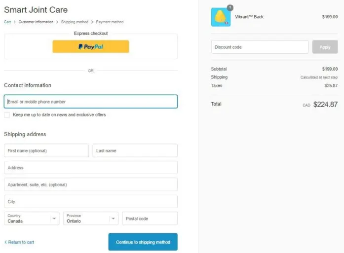
#2. Breadcrumbs Navigation
Rather than including a navigation menu on the checkout page, Shopify optimized it into the progress indicator or breadcrumbs. This is great as it not only saves space but also helps show users exactly where they are in the purchase journey.
Basically, Shopify has divided the checkout into three logical steps: Information, Shipping, and Payment. Customers can jump between steps by just clicking on any of these on the breadcrumb navigation.

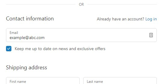
#3. Email Input Set as the Top
Asking email addresses at the top field proves such a smart conversion hack. In case users abandon their carts, this practice lets you easily follow up with them. This gives a chance to recover cart abandonment.
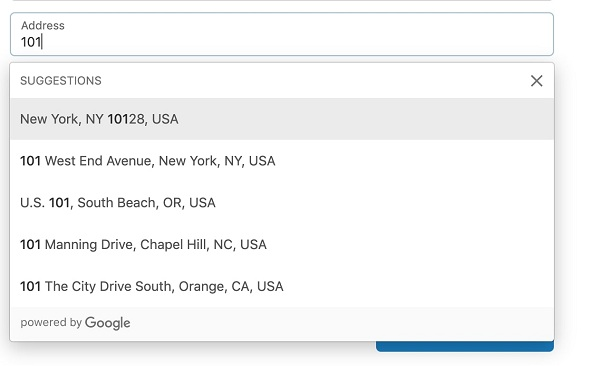
#4. Google Address Autocomplete
This Google Address Autocomplete feature, according to the Shopify developer team, can minimize friction at checkout and drive more sales to store owners.
As soon as buyers input some initial characters of their address in the address field, Google Address Autocomplete will display matching options. This stunningly contributes to creating a speedy checkout experience for customers by reducing the time spent on the checkout page.
Shopify did test this feature and they found out that the percentage of typos and time spent were fallen to 20%, not to mention there was an increase in the conversion rate.
#5. Multiple Express Checkout Options
As true as its name, Express checkout allows you to check out as quickly as possible.
Normally, customers have to fill out an average of 10 fields before placing an order. And you can imagine how irritated and time-consuming that ritual is.
Aware of that concern, most top online retailers, including Amazon have said “yes” to blazing-fast checkout by offering multiple express payment options.
Paypal has emphasized that utilizing Paypal Express Checkout “give customers a shortcut through the checkout process, making cart abandonment less likely.” Plus, this method also uplifts your conversion rate up to 3.75% and doubles your bottom line.
Fortunately, Shopify gives the go-ahead to these options on your checkout page.

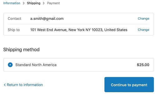
#6. CTA Button with Clear Instructions
Along with the breadcrumbs, Shopify also frees users from confusingly navigating through each checkout step with an instructive copy on the CTA button. These CTA buttons straightforwardly inform users of the next step or the previous steps.
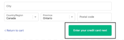
As you can see in the screenshot, Shopify provides the ‘Return to cart’ option on the left-hand side and show you the next step of entering your credit card on the right.
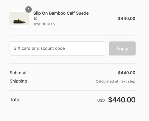
#7. Cost Transparency in the Order Total
You know what, unclear pricing happens to be the leading cause of cart abandonment. Around 17% of buyers abandoned their shopping cart as they couldn’t see the order total calculated up-front. (Shopify)
Shopify checkout swept away that annoyance by not only letting shoppers see their order total but also breaking down all costs. More than that, it guarantees cost transparency via the image and product quantity showed up along with the product name. Thanks to this, users surely know how many items are in their carts with corresponding total prices.
#8. Data Preview
When you proceed to the next step, Shopify will display all the essential fields you’ve already filled out at the top. This lets you check if you’ve keyed in the right information. And in case there’s a mistake, hit “Change” to be brought back to that field.
#9. Mobile Optimization
Shopify is already a nature-born eCommerce solution for mobile optimization. Do you know that no matter how many themes Shopify possesses, all of them share a similarity on mobile and conversion-focused?
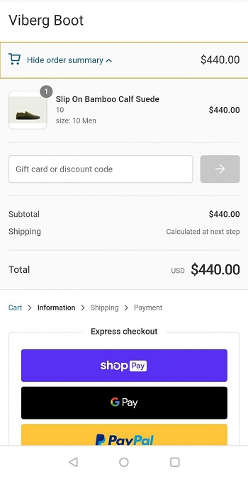
From the screenshot above, can you see the order summary at the top? Great to know that it’s collapsible, which doesn’t consume much space on a mobile screen. Users can tap on it to view order details once again before completing their purchases.
Shopify vs WooCommerce Checkout Page
To give you a clear picture of the Shopify vs WooCommerce checkout page, let’s put the default checkout page of these two eCommerce giants next to each other.
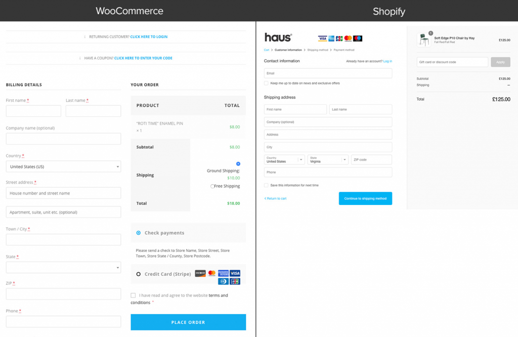
So which form would you like to fill out? Shopify or WooCommerce checkout page? It doesn’t leave us mouth-opened if your eyes gravitate to the Shopify one.
The Purple Ninja may outshine the Green Bag in every way, but it may lag behind its competitor in terms of checkout flow and design.
The default WooCommerce checkout page looks boring and confusing. Instead of serving its main duty at growing sales, the page seems to concentrate on asking for customer data.
It’s stuffed with numerous input fields on one page, laid out one below the other. More importantly, you can’t split them into multi-steps or set up vital fields, e.g. email addresses or phone numbers on top. This appears as the root cause of thousand WooCommerce store owners missing out on sales.
And in case you want to tweak the page, you have no other choice but to play with a bunch of custom code.
Plus, it’s impossible to optimize the default WooCommerce checkout page on mobile. Not mentioning the lengthy layout, even not all the WooCommerce checkout themes are mobile-optimized.
On top of that, Shopify uses Ajax for every single checkout step, meaning that you won’t need to reload the page. WooCommerce, on the other hand, lacks Ajax out of the box, so you must reload multiple times. This makes reviewing and editing your carts during the checkout process a real pain in the butt.
As such, when it comes to Shopify vs WooCommerce checkout page, the battle lines are drawn.
Fortunately, creating WooCommerce one-page checkout is not the only way to optimize your default checkout. With the diverse WordPress plugin systems, you can convert your basic-looking and low-converting WooCommerce checkout page into a Shopify-like one like a wind.
How to Create a Shopify-like WooCommerce Checkout Page
In this tutorial, we opt for CheckoutWC. This is such a simple-to-use plugin that can transform the default WooCommerce checkout page into a high-converting Shopify checkout style in a second.
The plugin boasts tons of advanced features you can dream of, such as:
- Easy express checkout
- Account creation/login with automatic lookup and simple creation
- Autofill addresses and integration with the Google Maps API
- Direct integration with a wide range of major WooCommerce plugins.
Plus, CheckoutWC supports Ajax. This sweeps away all the back and forth as users don’t need to reload the page for updating items.
All in all, CheckoutWC remedies all the negatives that we have identified with the WooCommerce platform.
You can sign up for CheckoutWC free trial for 7 days to get to know how it works. The process of setting up a Shopify-styled WooCommerce checkout page goes through 4 easy steps.
- Step 1: Sign-up for a free trial of CheckoutWC
They will ask for your credit card, but no worry, you only get billed at the end of the trial.
- Step 2: Install the CheckoutWC plugin
Once you sign up, a link to download the plugin zip file will be attached to your email receipt or on the thank you page.
You can install the plugin by unzipping the file and uploading via SFTP or simply go to Plugins > Add New in your WordPress dashboard.
Upon installation, click Activate.
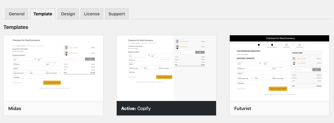
- Step 3: Select your desired template
Head over to Settings > Checkout for WooCommerce > Templates. Among hundreds of Shopify checkout page carbon copies, choose Copify.
- Step 4: Add your logo and view your new checkout page
Switch to the close-by “Design” tab, select Logo > Upload Images. Remember to save your changes.
![]()
Now, it’s time to preview your new checkout page.
Back to your new checkout page, add a product to your carts, click checkout and enjoy your new Shopify-like WoooCommerce checkout page.
CheckoutWC Alternative
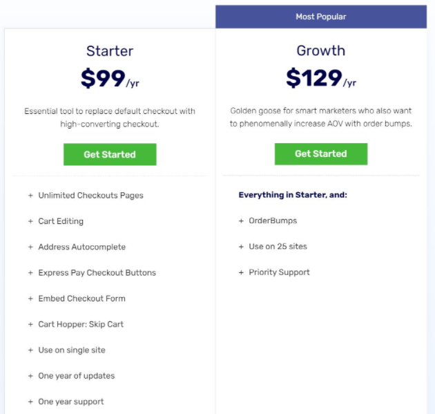
If the price of CheckoutWC makes you hesitating, let’s consider another great alternative for creating a Shopify-styles WooCommerce checkout page – Aero Checkout.
Using Aero Checkout and you’re free from building a checkout page from scratch. It houses a diverse collection of pre-design and high-converting checkout templates, including one-page checkouts and embedded forms that you can use on the spot.
Some striking features of Aero Checkout are:
- Multi-step checkout pages
- Mini cart modification
- Fields preview
- Google Address Autocomplete
- Mobile-optimized checkouts
Depend on your business scale, you can choose between the two plans Starter and Growth.
Ready to Modernize Your Default WooCommerce Checkout Page?
WooCommerce is endorsed by millions of users from pole to pole thanks to its flexible and extendible nature. However, when it comes to the checkout page, it’s not ahead of the game.
This article has spelled out Shopify vs WooCommerce checkout page, as well as easy ways to build a Shopify-style checkout for WooCommerce.
Want to rocket your conversion, rack up sales and leave your competitors in the dust? Start to modernize your default WooCommerce checkout page now!
Interested in Shopify vs WooCommerce comparison? Check out our review on Shopify vs WooCommerce SEO here!