Believing or not, email remains the most universal form of communication, though mobile instant messages or social networks are also taking hold. It’s estimated that half of the population worldwide uses email by 2019, with over 3.8 billion accounts all over the world.
In terms of a marketing perspective, email proves a clear-cut winner in building a customer base.
But how to create a customer list via emails? You need to attract people to your email lists first! Among thousands of methods out there, newsletter sign-up forms appear to be the simplest yet most workable solution.
The topic for discussion today centers on how to increase your email lists with newsletter sign-up forms. Along with that, trustworthy tips to optimize your newsletter sign-up form, as well as outstanding examples, will be brought to the table as well.
- Which Types of Sign-up Forms Should You Use?
- #1 Give An Enticing Headline
- #2 Clearly Point Out the Value
- #3 Write Conversational Copy
- #4 Offer a Special “Subscribers only” Incentive
- #5 Minimize Your Form Fields
- #6 Showcase Social Proof
- #7 Consider Signup Form Placement
- #8 Use a Clear, Strong Call to Action
- #9 Utilize a Double Opt-in
- #10 Add a Sense of Wit and Humor
- #11 Make Your Forms Mobile-Friendly
Which Types of Sign-up Forms Should You Use?
There is a wide range of sign-up forms, which each type serves a different purpose. We have listed several popular ones in this post, namely landing page forms, inline forms, and popup forms.
Landing Page Forms
In short, a landing page form refers to a page that contains only a form without any distraction elements on it, such as a sidebar, navigation menu, or other download links. The sole purpose of the landing page form is to convert visitors into leads.
Its design principle is strictly based on the “Goldilocks syndrome.” While a lengthy landing page can drive prospective customers away from converting, a too-short one may not gather enough data to qualify visitors as worthwhile leads.
Inline Forms
Inline sign-up forms are the forms you embed into your webpage. This type of newsletter sign-up form lets you place them anywhere on your sites, e.g within the body of your content, on the top, or at the bottom of your pages.
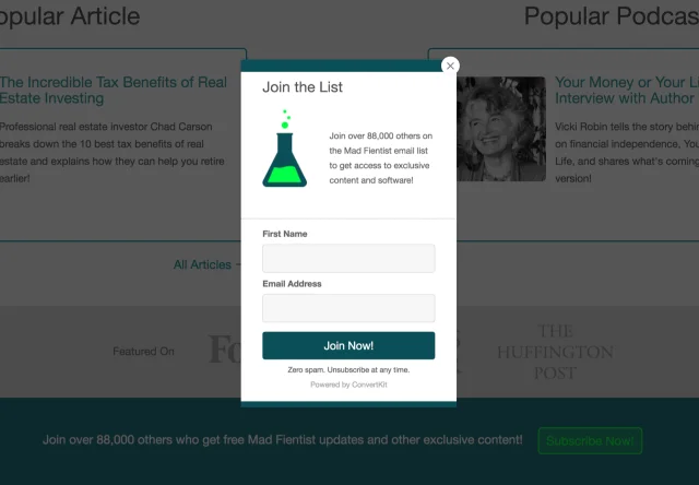
Popup Forms
Other than being embedded into your pages, popup forms are set up to appear at a certain point during user engagement on your site. This comes in handy in significantly grabbing user attention. However, in terms of user experience, they can interrupt user flow.
As a site owner, you can decide the suitable popup forms for your site, including:
- Timed-delay popup: this type of newsletter sign-up form lets your visitors view your content before showing up.
- Stroll-delayed popup: it allows visitors to be more engaged with your content as it appears after users spent a specific time scroll down your pages.
- Two-step popup: A two-step pop-up form shows up after someone clicks a link or button on your page. This type of sign-up form typically results in high conversion rates since readers intentionally click the button or link to grasp the carrot you are offering.
- Exit-intent pop-up: this type of newsletter sign-up form is considered the “save the last chance” option. It pops up when your potential leads are about to leave your site.
Since you know different types of sign-up forms to grow your email list, in the next sections, let’s discover 11 effective ideas optimizing your sign-up forms to grow your email lists.
#1 Give an Enticing Headline
The headline must be the first thing users see when they land on the page. You need to come up with an enticing headline that fully catches user attention as well as arousing interest in them. What’s more, it must be to the point by clearly indicating what you’re gonna offer to subscribers.
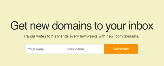
Take the newsletter sign-up forms of Hustle Panda as an example. Before your eyes is a compelling headline that concisely points out their offer – receives new domains via newsletter.
#2 Clearly Point Out the Value
Apart from giving a straightforward headline, it’s necessary to attract users by completely communicating the benefits they’ll get in exchange for their emails. One proven tip is that you should describe the value of your content in your newsletter sign-up forms.
Informing readers that by signing up, they’ll receive great tips, discounts, savings, or any other subscribe-worthy incentives.
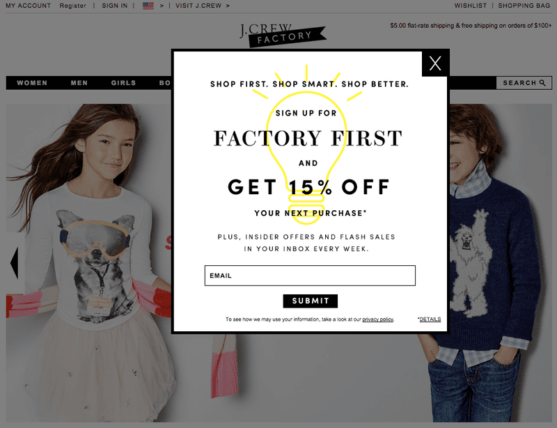
J.Crew Factory owns an excellent newsletter sign-up form, which clearly points out the value to their customers. Besides getting 15% off, subscribers can gain insider offers and flash sales as well.
#3 Write Conversational Copy
One problem with marketing messages is they lack personality and emotional feelings.
As a matter of fact, readers always crave human touch. Conversational content will create a connection between site owners and readers. This leads to more opportunities to get your services and products off the ground.
So how to write conversational copy?
Writing conversationally doesn’t mean you write the way you talk. The following techniques will make your content sound more conversational:
- Avoid writing to everyone by always targeting a single reader.
- Use a simple writing style with empathy in mind.
- Engage your readers with rhetorical questions.
- Shorten your sentences with commas.
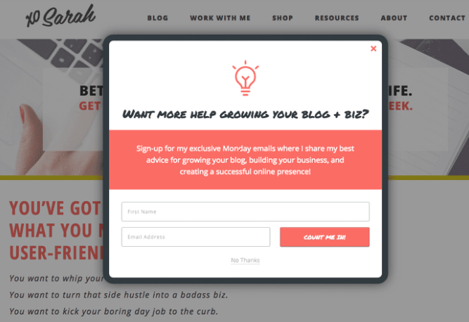
Xo Sarah includes a punchy copy with an eager and energetic tone in its form. They use the words “my,” “I,” and “your,” which makes the copy more personal and communicative.
#4 Offer a Special “Subscribers Only” Incentive
Another great way to generate more opt-ins to your site is by offering users exclusive access to certain kinds of content or deals, resources, and more.
Note: This tactic works for popup forms only.
#5 Minimize Your Form Fields
Asking too much information will cringe readers. The fewer your sign-up form fields are, the more likely your site will get a higher conversion rate.
Thinking about your sign-up goals, whether you want new subscribers or lead generation. If the case falls on the former one, all you need is an email address. On the other hand, for lead generation, subscriber’s names may be essential in personalizing your emails.
Bear in mind the K.I.S.S (Keep It Simple) principle. For the newsletter sign-up forms, the shorter, the better. The ideal number of form fields should be one or a maximum of two.
#6 Showcase Social Proof
Have you ever heard about the bandwagon effect?
According to Effectiviology, the bandwagon effect refers to “a cognitive bias that causes people to think or act a certain way if they believe that others are doing the same.” In other words, it states that human beings tend to follow the crowd.
For example, they are likely to trust an answer or comment on social platforms that get lots of likes or upvotes.
Savvy marketers make use of this effect to influence customer decisions on which products or services they’re gonna buy. This proves clearly via social proof.
There are many types of social proof you can use for your sign-up forms, including:
- Celebrity endorsements or influencers
- Industry experts making recommendations
- Wisdom of crowds
- People sharing on social media and other platforms
- Current user and customer reviews
- Official stamps of approval
Among them, the wisdom of crowds happens to be the most favored method.
Similar to word of mouth, numbers also serve as a powerful tool to build trust and stimulate readers to sign-up. Publishing how many subscribers you have helps demonstrate the authority of your site.
Plus, showcasing the statements as “140,351 subscribers” or “300,000 people have registered” can comfort hesitant visitors to take the plunge.
#7 Consider Signup Form Placement
Newsletter sign-up form placement carries lots of weight in capturing leads as well as building up your email list. While some readers may be impressed with pop-up forms, others find a form embedding on your site more successfully stirs their curiosity.
The thing is your forms must be positioned in the most noticeable yet natural placement. This not only helps catch the user’s eyes but also smoothens their experience.
Several strategic spots that most marketers will choose to place sign-up forms are on top of the sidebar, top header, after a post, footer, or on the pop-up box.
You can even consider multiple newsletter signup options at once, however, try to avoid coming off as spammy.
In point of fact, there is no magic strategy when it comes to optimizing newsletter sign-up form placement. What works for one website can become a fall flat for another. The only way to determine is by testing your form. Placing your sign-up forms in different positions, asking your friends, loyal users to test them, and drawing the conclusion.
#8 Use a Clear, Strong Call to Action
A well-placed and strong call to action not only urges users to take action but also boosts conversions and significantly contributes to growing your email list.
Instead of keeping the boring “Submit” or “Sign-up” word, you need to think of a concise, jargon-free phrase with actionable verbs catching the reader’s attention.
For example, if you aim to provide free guides, your CTA copy can be straightforward as “Send me free guides!”
Following are some effective copywriting tips for newsletter sign-up CTA:
- Begin with verbs and subjects.
- Make sure the CTA is between 90 and 150 characters.
- Keep the copy less technical and more practical.
- Use personal or possessive language.
- Add some sense of urgency.
Aside from that, it’s essential to give your CTA button design feasting their eyes. An effective CTA button first, must be an outstanding one, making visitors notice its existence. As such, you must ensure the CTA button color contrasts with your web design.
Last but not least, positioning your call to action on high visited pages is strongly recommended.
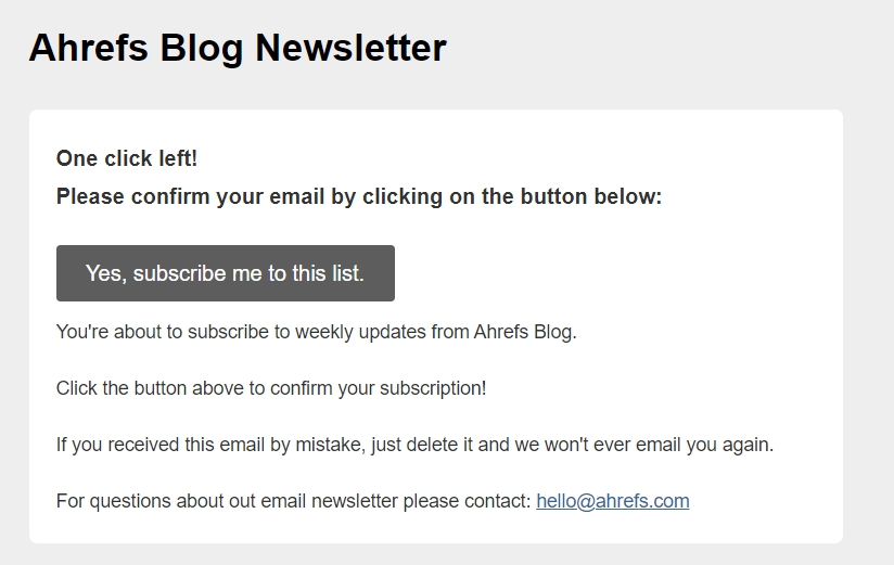
#9 Utilize a Double Opt-in
The core base of growing your email list is the quality of sign-ups. This means fewer fake leads, spam emails, or email blacklists.
Utilizing a double opt-in assists you in ensuring the sign-up quality on your form. In a nutshell, this type of email subscription requires your lead confirmation on receiving newsletters twice.
Once visitors submit their email addresses via your newsletter sign-up forms, right off the bat they will receive a confirmation email. Your leads will need to assure their submission by clicking on the provided links or another CTA button attached in their inboxes.
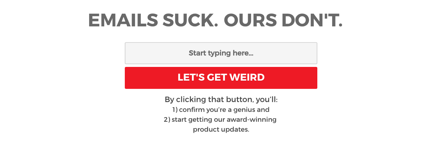
#10 Add a Sense of Wit and Humor
Besides the conversational tone, adding a sense of humor and sharp wit to your sign-up forms will leave a vivid impression on your readers. This also contributes to shaping trust and increasing user engagement on your site.
A round of big applause for Shinesty sign-up form. It boasts funny and clever and creative language in both the header and call to action. This goes along with its general tone and style very well.
#11 Make Your Newsletter Sign-up Forms Mobile-Friendly
Statista pointed out that more than 51% of global website traffic comes from mobile devices. Therefore, you should pay attention to optimize your forms to a mobile-friendly one to drive more potential leads.
How to make your newsletter sign-up forms mobile-friendly?
First and foremost, you must be aware of the mobile popup penalty. While pop-up forms seem a popular tactic for desktop users, porting the same strategy over mobile readers can be counterproductive.
As Google announced, “pages where content is not easily accessible to a user on the transition from the mobile search results, may not rank as high.” This means it may hurt your ranking on Google mobile search if users land on your site and interact with your popups before they digest your content.
Secondly, it’s important to make submit buttons touchable. The smaller the touch targets are, the harder it is for users to finish their forms. The ideal button size is around 60 px, with a bare minimum of 12 px spacing between the button and other clickable elements.
Ready to Put These Tips into Practice?
This article has shed detailed light on 11 viable newsletter sign-up form ideas to grow your email list.
Email sign-up forms are the simplest yet most effective ways to generate leads, create more conversion and take your sales to the next level.
To maximize your chance of converting your users, you need to take every form element into serious consideration, from types of forms, headline, content, to CTA copy and design.
Especially, bearing in mind to create SEO-friendly content to make your forms on mobile version work well on search engines. Paying attention to test your forms and you’ll have the up-to-scratch ones.
Still have questions on newsletter sign-up form ideas to grow your email list? Let us know in the comment section below!